I think it's rather difficult to determine a specific "settings configuration" that accurately represents 90's CGI, more of a series of tweaks, mainly in the vein of "breaking the modern rules" of shading, I think is what's needed to get the effects you want.
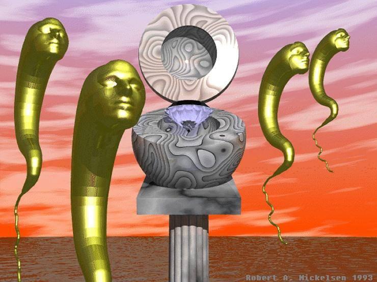
To me, 90's era CGI is defined by several factors. The first, and most obvious being limited geometry (ie fewer subdivisions), however also high on the list are approximated light reflections (so eevee is good), with less than perfect roughness and transparency/translucency (because caustics were very expensive back then), but a focus on metallic looking surfaces, and pronounced specular dots in lieu of accurate reflections. I also seem to remember over-saturated colors, as well as confused color schemes/tone maps to compliment (or insult?) the other objects in the scene.
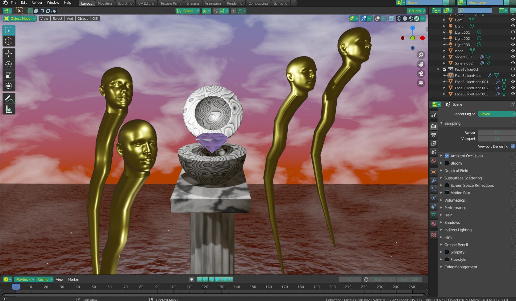
In the scene I made below, I didn't do anything really special. The most notable thing I did was to use the back-facing output of a geometry node as the Mix Factor between a Transparent BSDF and the rest of the components on the Gem to make it give that "hollowed out" look, like in the image. I also used the Parametric output to control the Mix Factor with an Emission Shader. I don't know if it's "right".... it certainly is "wrong" according to the conventions I learned, but it seems that the idea is to "break the rules" somewhat, in order to "degrade" the look of things, so to speak. I also left a Layer Weight Node next to the roughness input of the Principled BSDF that makes up the gold material. I left it unconnected because I couldn't decide if it looked "better" or "worse" without it. Connecting either the "Facing" or the "Fresnel" output to the roughness both give some interesting results (so long as the metallic is sufficiently high). Everything else, I mainly achieved just by keeping the roughness above 0 and playing with the specular values. I added a couple of extra lights to the scene, but I did not change any of their settings, and for the sky, I "cheated" the ambient lighting generated by the texture by using the "Is Camera Ray" output of a Light Path Node, to give a grey-orange ambient light instead.

The last step was just trying to make sure I wasn't (noticibly) using any advanced (compared to the 90's) features such as screen space reflections. I did cheat and use some bump information for the water, but that was just to save me the trouble of baking.
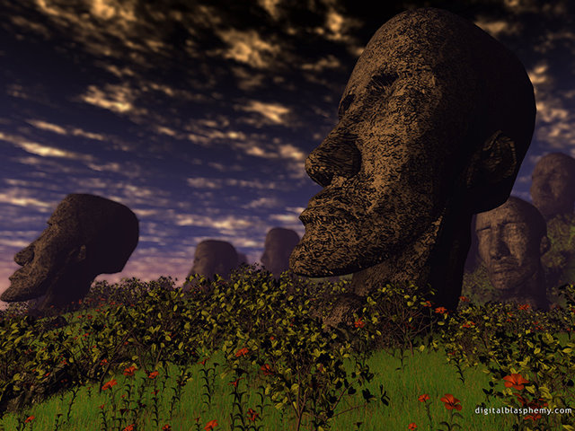
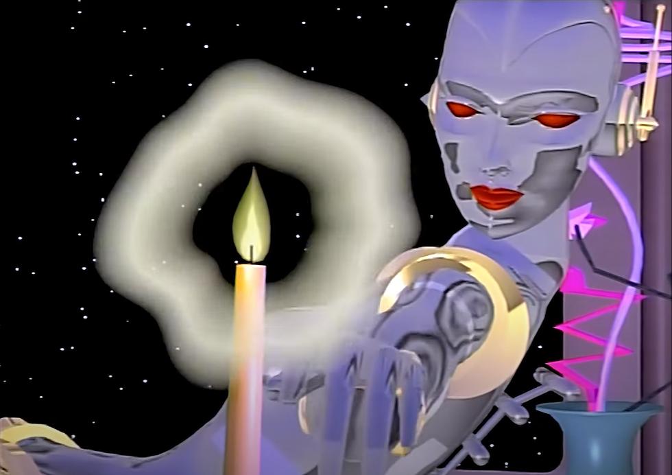
I'll include the .blend file so you can play around. I'll also keep working on examples of the other two images you posted, though I'm rather busy so it might take some time. Feel free to experiment in the meantime. I think the idea is to make the scene look "wrong" but in the "right" kind of way, if that makes any sense.
NOTE - I used a face-builder add-on to get the heads for the scene, but I'm not sure if they'll transfer with the file correctly. I'm hoping they do. If not, you'll have to use your own mesh, or Suzanne or something.
File is here - 

