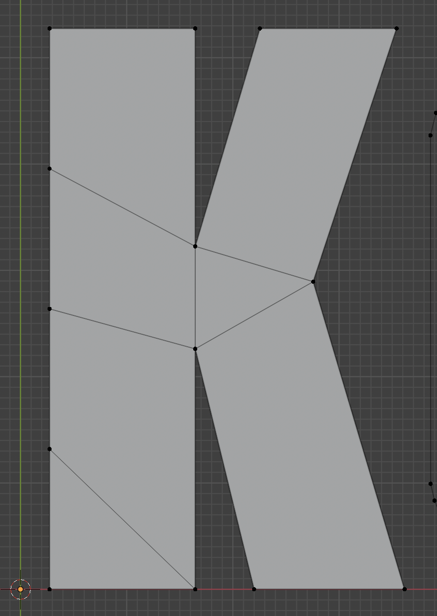
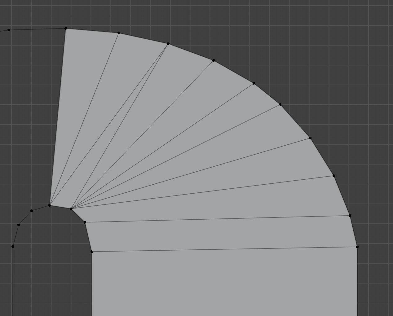
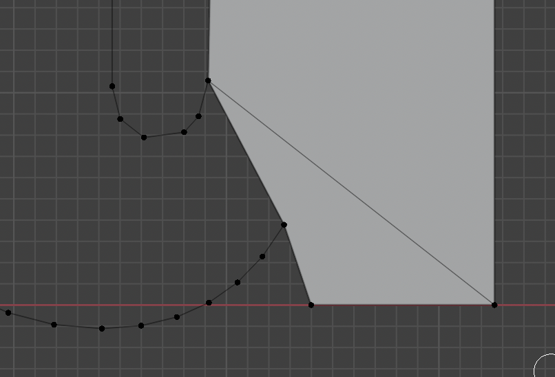
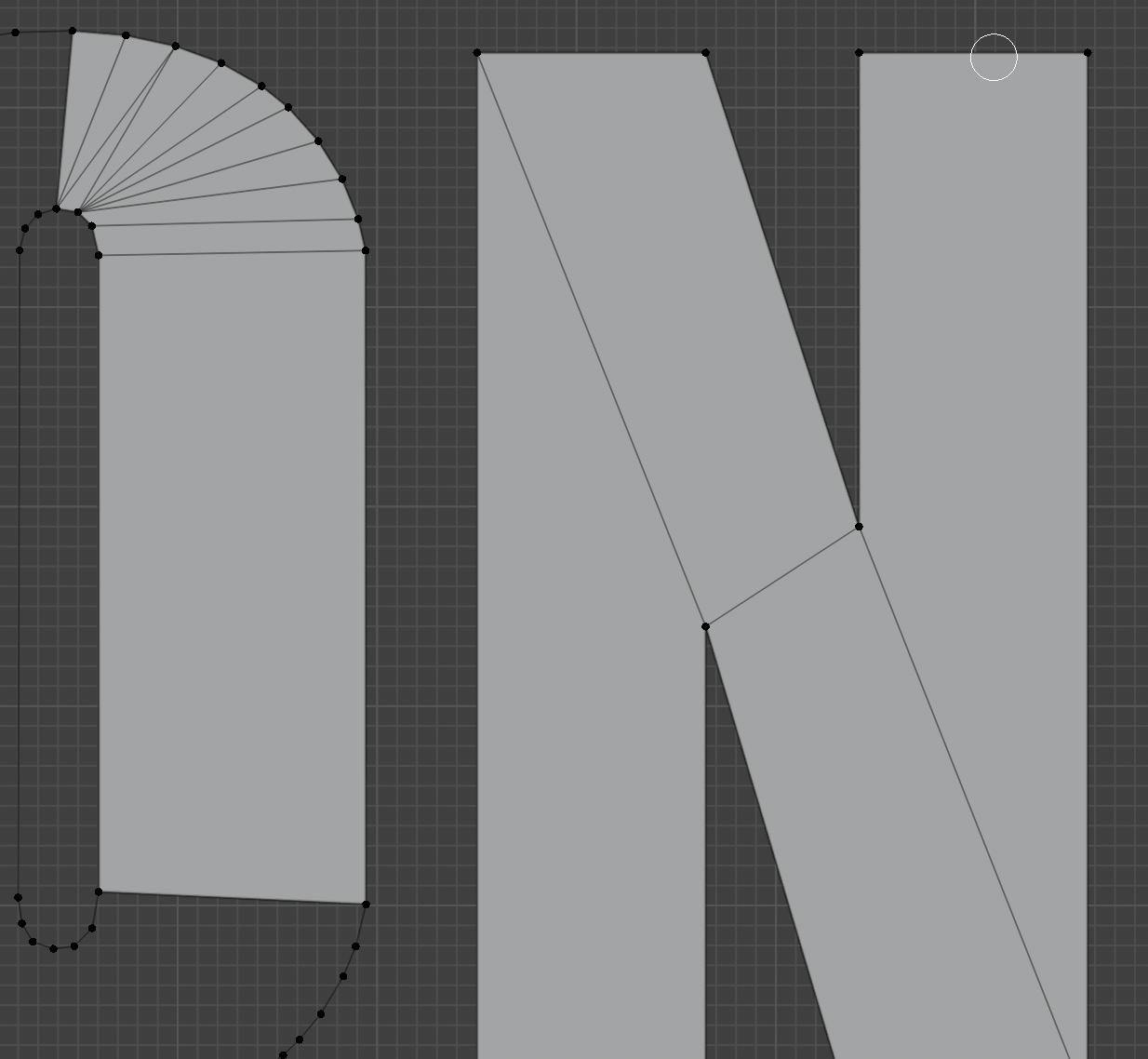
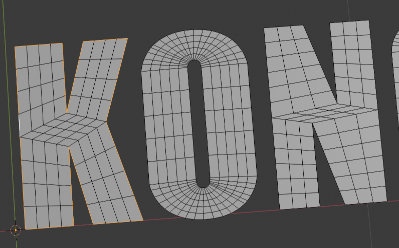
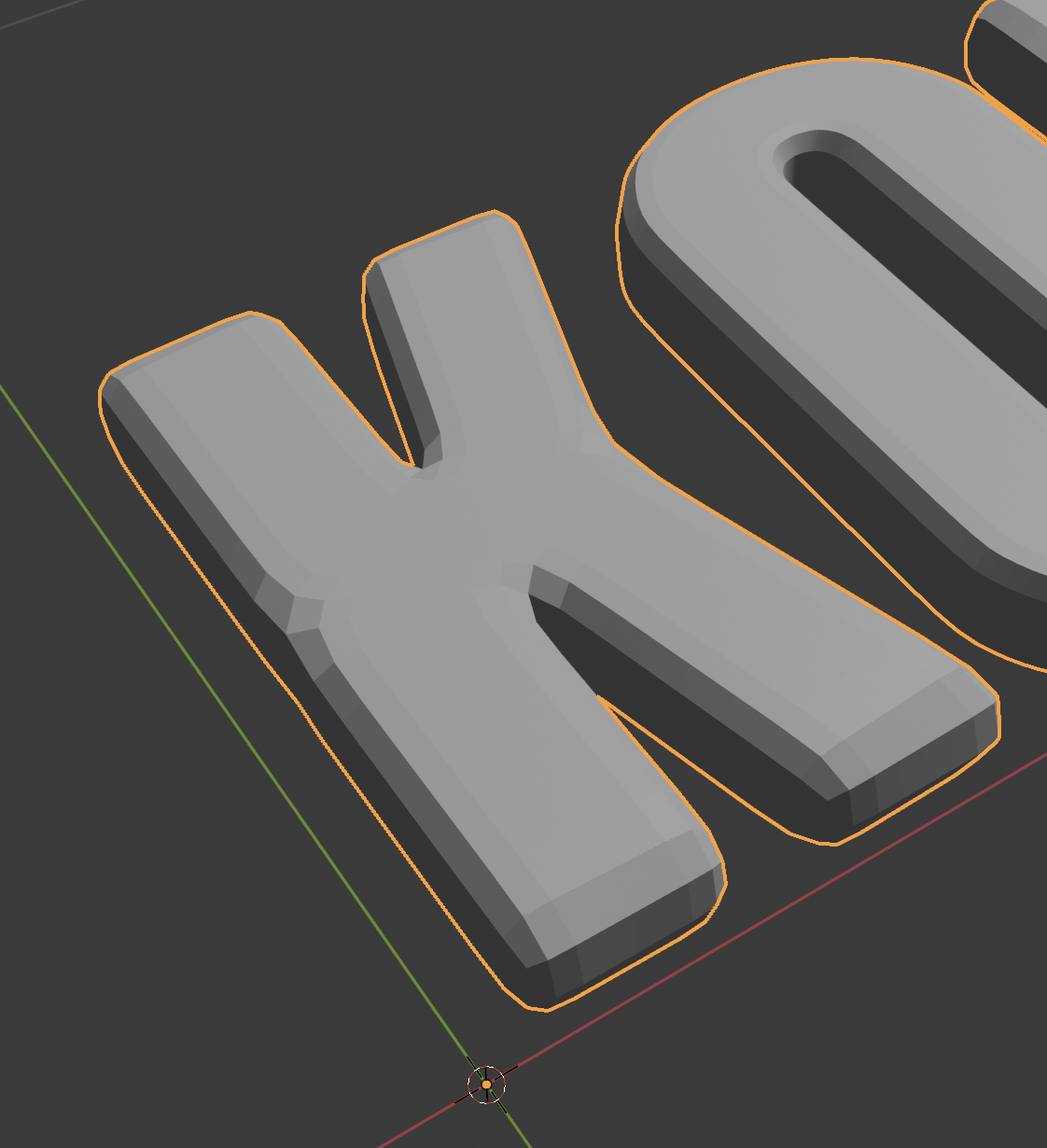
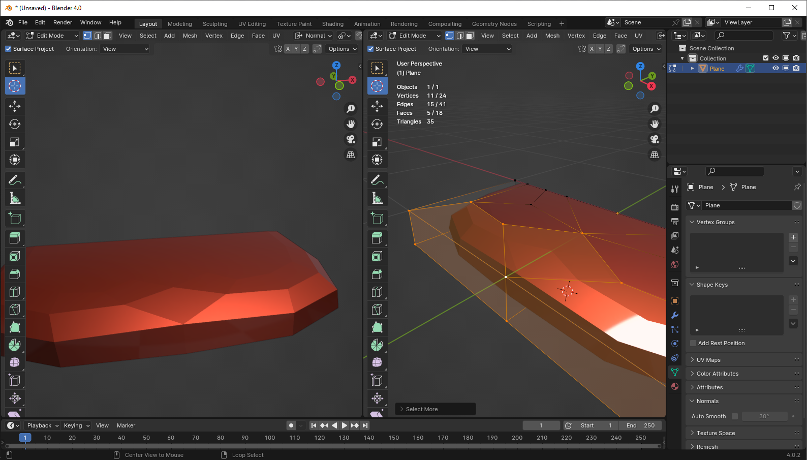
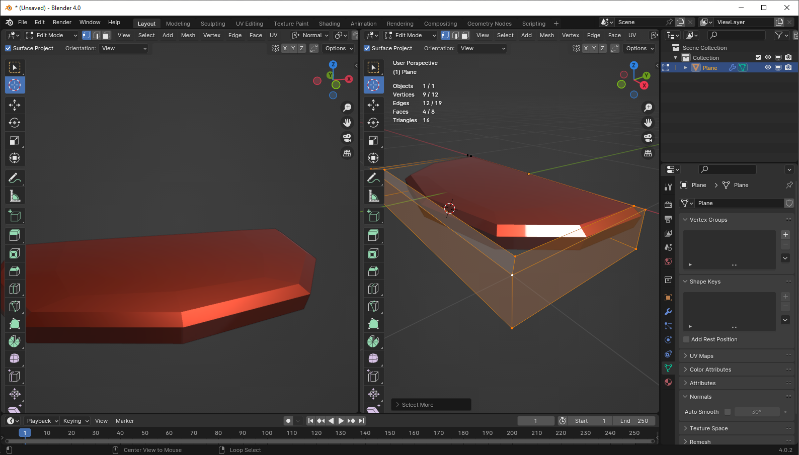
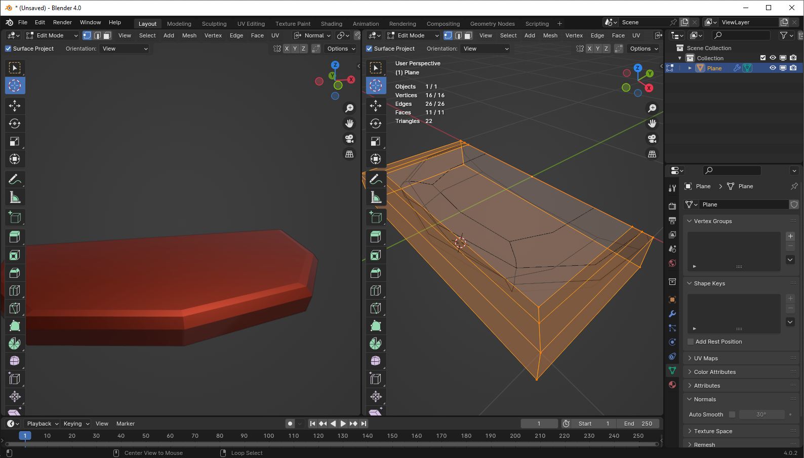
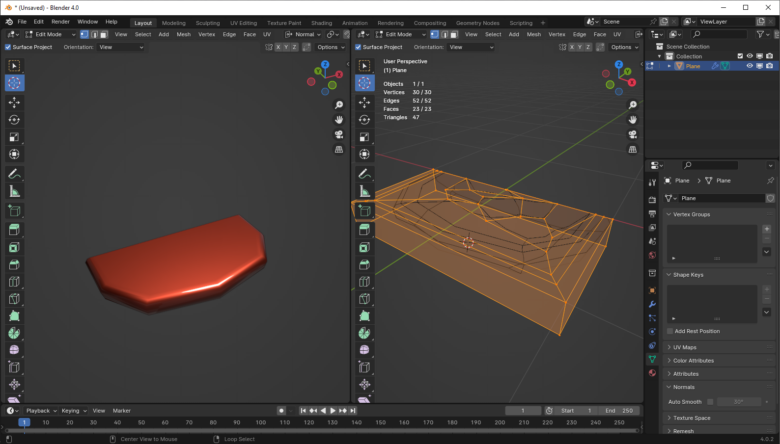
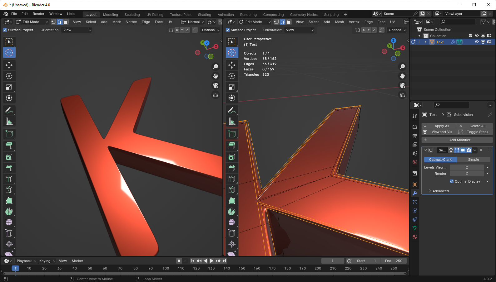
I am trying to add proper topology to text so I can do a beveled edge and a boolean extrude from a shape later on.
I am following this video, however I find it pretty confusing when it comes to applying the steps to my file.
In the video, the shapes always have the perfect amount of vertices on each side for quads to be generated, but in my project that is not the case:
What I am doing doesn't look right, some faces are triangles, some are quads, the distribution of which is irregular, and I can't really understand what I could be doing differently except adding a bunch of extra vertices randomly, for which there doesn't seem to be a keyboard shortcut in my version. Simply put, it doesn't look good.
From one letter to the next, I have either a lot of faces or very few, which might create inconsistencies later on.
Do I want to keep the amount of vertices low, or should I add a lot of them? How can the shapes have the same amount of vertices on each side of the shape to create quads without deformation?
Given the examples in the screenshots, what am I doing wrong and what is a fast workflow to create correct topology inside these letters?
I have been looking it up for a few hours, and the major changes from Blender 2 to Blender 4 make it difficult to find relevant answers. I do not want to use a Remesh modifier.

