The following is help from a design perspective, more than a tutorial on how to achieve this all within blender, so an edit to do these things is more than welcome.
You've made some good headway and his chest and legs are looking great/similar to the reference. The feedback I'm going to provide is more thorough than it is a reflection of the quality of your work, so hang in there :)
Most important difference is the color scheme. Colors are VERY important. You can create a cool color scheme for free using Adobe's online color scheme app. (just google 'adobe kuler') the closer it resembles life, the less abrasive it will feel to the viewer.
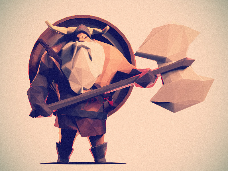
There's a 3 point lighting set up on the original artwork. The back light (rim light) helps to subtly highlight the edge in the silhouette. The colour scheme for the original has a golden hour feel to it. Golden hour is a film term for the time of the day with the most beautiful warm colors appear to saturate the day. If you type in Golden hour into the 'explore' portion of kuler you'll find hundreds of variations.
On the other hand, your lighting setup looks a little too much like a desk lit table top in comparison, and the effect is a little mundane of a situation... I feel like you can do a lot better than that!
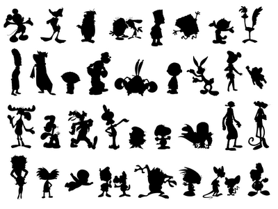
The next problem you'll need to tackle to get close to the quality of the original is the silhouette previously mentioned. Take the original into a image editor and trace a line around the form of the character and his accessories. See how even the silhouette ALONE says everything about the character, and in an interesting way?
Silhouette is paramount to a good character design, because a good character must be easily recognized and our easiest way to identify an object is through the silhouette.

See how easily you can identify an character with silhouette alone? It matters big time. So take a careful look at your character and see how you can push him so that he has a more interesting/unique silhouette, and somehow it'll appear cooler :). The rule of thumb for pushing, is choose the most interesting aspects of the character and make them read more.
Another point about silhouettes is that they can make or break a character depending on the intent. For instance, your character looks quite round and therefore cuddly, if you are going for a mean badass viking, you might want to try something a little more angular and foreboding.
The last big thing to address is that you seem to have a few too many continuous strips/groups of flat planes of geometry in your character. At the moment he looks a little lifeless. Adding extra dimension here and there will breath some character and life into your creation, like there is in the original. To do this, find pictures of strong men on google from different angles and pay close attention to the angles of their faces and muscles. Try not to go overboard, because too much detail = straying from that simplistic style. Just think of each triangle as though it's a brush stroke in a minimalist painting.
And on a minor note, the original artist has applied a film grain and vignette. The grain breaks up the subject a tad to make it seem less perfect, the vignette softens the corners and draws attention into the subject.
But you've made a fantastic start my friend, the quality is above average.


