2
$\begingroup$

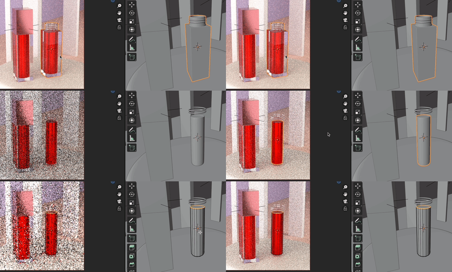
I've been struggling with this bottle's material. Especially the cap and the base.

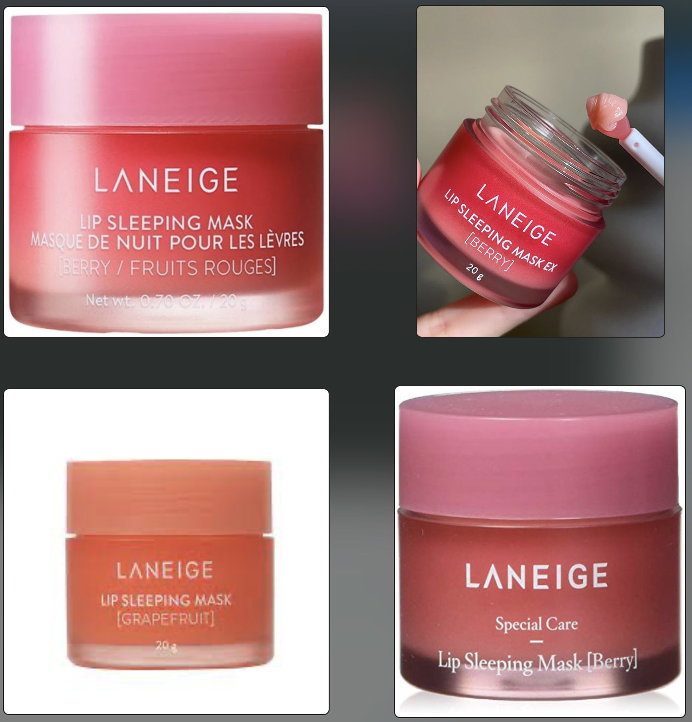
Reference images

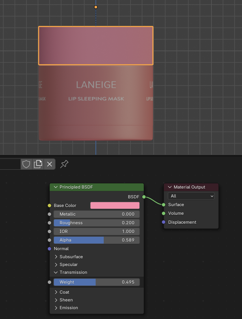
The cap seems to be a translucent material so I've been experimenting with IOR, Alpha and transmission in the principal BSDF. The spirals used for closing the cap is almost visible.

Whereas the base is more clear but heavy.

I'm new to Blender and materials so I've been able to make this model. Should I use the solidify modifier to give it some thickness and then give the inner material colour but keep the outer material transparent?

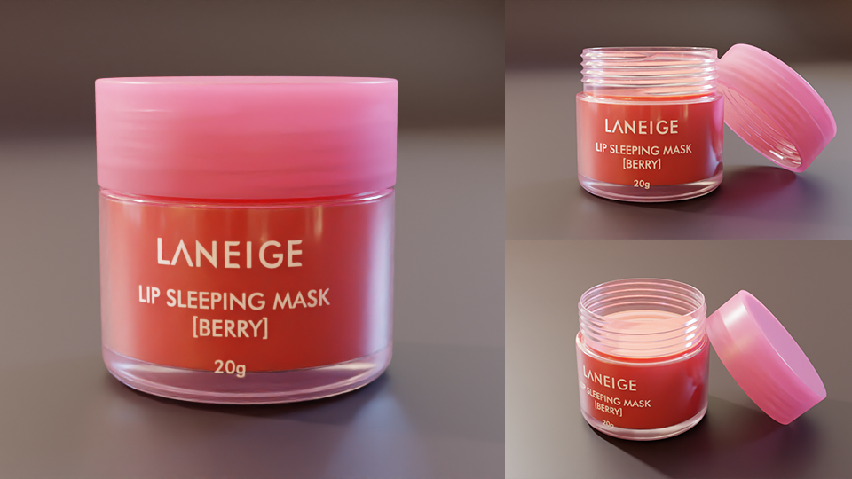
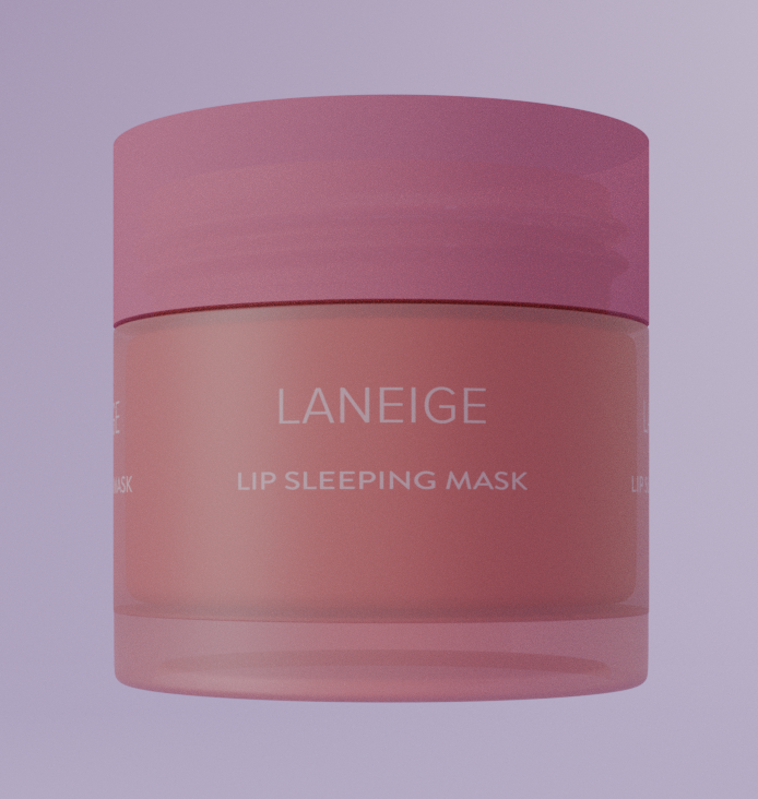
What I've made so far

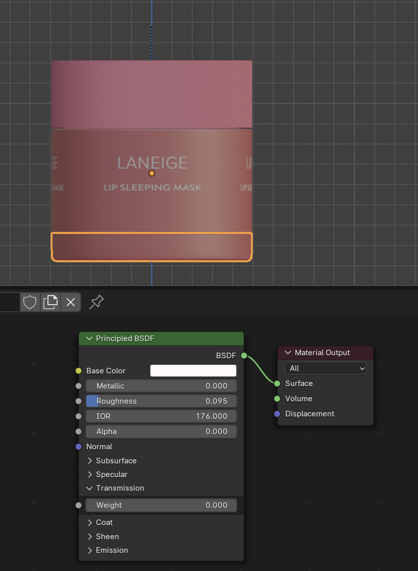
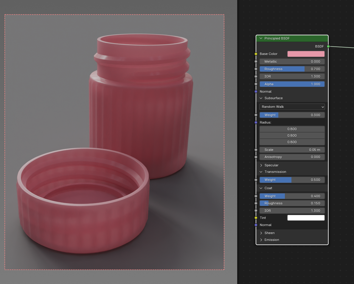
BSDF for the cap

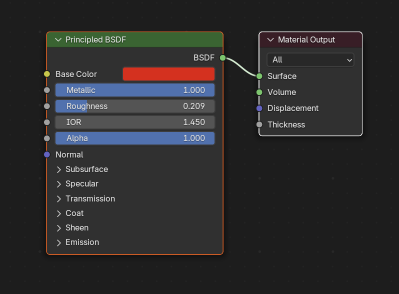
BSDF for the base Not sure why the base is pink when I've chosen white as it's base colour.

Please excuse UV wrapping of the text.

Any suggestions/ feedback would be very helpful at this point.

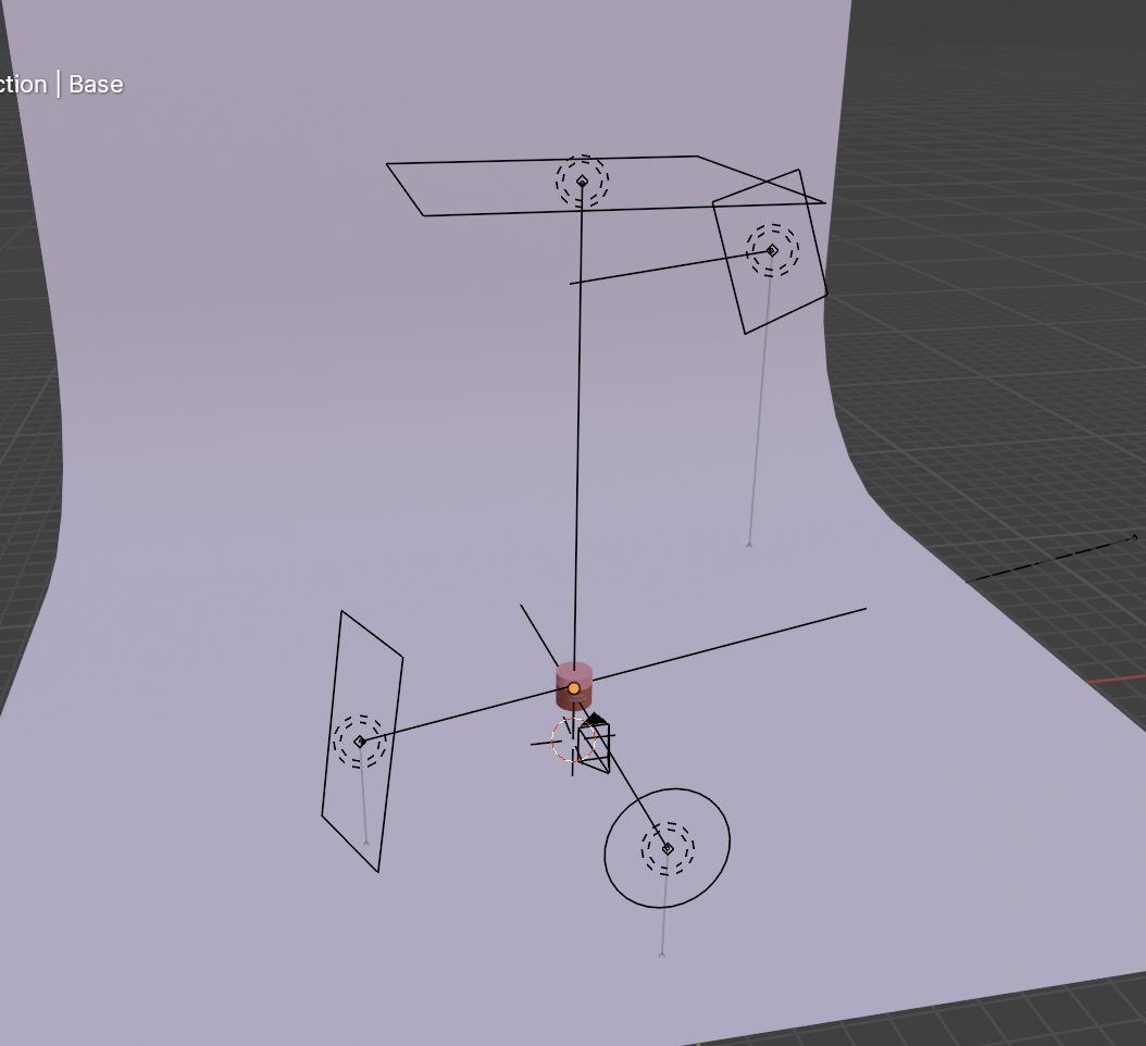
Edit 1: Adding my light setup. There are some more objects and materials in the scene that I've removed for this post.

Light setup

Edit 2: Thank you for all the helpful comments! I will work them into my model.

Edit 3: Youtube link to the bottle: https://www.youtube.com/watch?v=dXHziIt9MUE

Edit 4: No one is probably reading this anymore but you guys are THE BEST!

$\endgroup$
5
  • $\begingroup$ The first thing to do would be to light it in a reasonable way. You couldn't see the material even if it was perfect in this light, so how can you make it better? $\endgroup$ Commented Apr 25 at 22:03
  • $\begingroup$ @MartynasŽiemys I actually have considered this. Currently I have a small spherical (area) light in front of the subject, a top light and one strip (area) on the side. The background is lit by one area light as well. There is a HDRI as well. Do you have any suggestions to improve this light setup? $\endgroup$
    – Der8
    Commented Apr 25 at 22:23
  • 1
    $\begingroup$ First of all I would get rid of this ridiculously high IOR of 176(!), the default of 1.45 (or I think 1.5 in latest versions) is totally fine and as long as you keep it in a realistic range between 1 and 2 it will not make much of a difference (and definitely not matter much for translucency). About the bottom material: sorry to ask, but has it really the white material assigned? It looks exactly like the part above it and with an Alpha value of 0 it would be invisible (not transparent, translucent or anything... just invisible). For realistic results, do not decrease Alpha, leave it at 1. $\endgroup$ Commented Apr 25 at 22:37
  • 1
    $\begingroup$ @Der8, I think it depends on what lighting you are after. I would recommend looking for some inspiration for lighting specifically online and getting some reference images and then try to replicate lighting that you like. It is relatively fast to try, so you can try a few different versions, a few different HDRIs and see what you like. If you are using Filmic or AgX, maybe try different contrast presets as well. $\endgroup$ Commented Apr 25 at 22:51
  • $\begingroup$ @GordonBrinkmann Thank you!! I was using the slider to see what is getting me a good result and may have gone wild. Thank you so much! Its definitely the base (i tried removing the cylinder) but there is something wrong going on there. I will recheck. $\endgroup$
    – Der8
    Commented Apr 26 at 6:47

3 Answers 3

3
$\begingroup$

I've tried to create something useable as well. Admittedly I did not just use a simple Glass BSDF. The jar is made with a Principled BSDF with a very slight pinkish color and Transmission > Weight set to 1 for the glass part and 0 for the text by plugging a mask texture into the Weight input. I made the glass not totally clear with 0.1 for the Roughness.

I could have used the mask to also give the text a different color than the glass, but it looks almost white so I left it like that.

To slightly increase the pinkish color where the glass is thicker I used a Principled Volume node with a pink color and a density of 5. (Actually for a simpler and quicker to render volumetric effect I should have used the Volume Absorption node.)

Glass material:
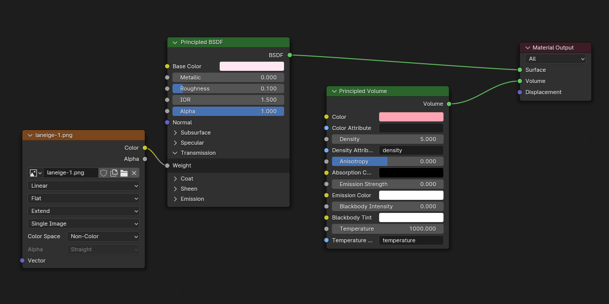
glass material

The lotion material is very simple, I gave a Principled BSDF some peachy color and set the Subsurface > Weight to 0.8 but the effect is not so really good visible.

Lotion material:
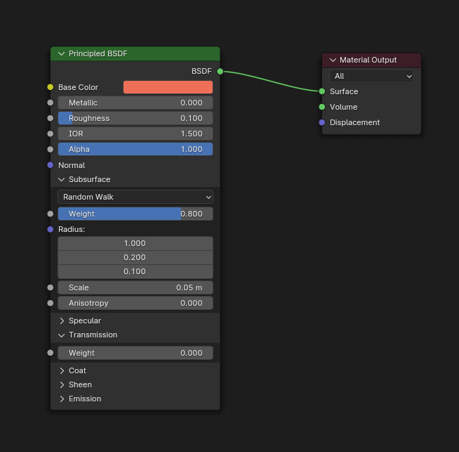
lotion material

For the lid I tried to combine transparency and translucency. In the Principled BSDF with pink color I increased the Roughness to 0.3, made it only half transmissive with a _Weight _ of 0.5 and also gave the Subsurface a Weight of 0.5 and then mixed it with a Translucent BSDF of the same color, giving a little more priority to the translucency by setting 0.7 as mix factor.

Lid material:
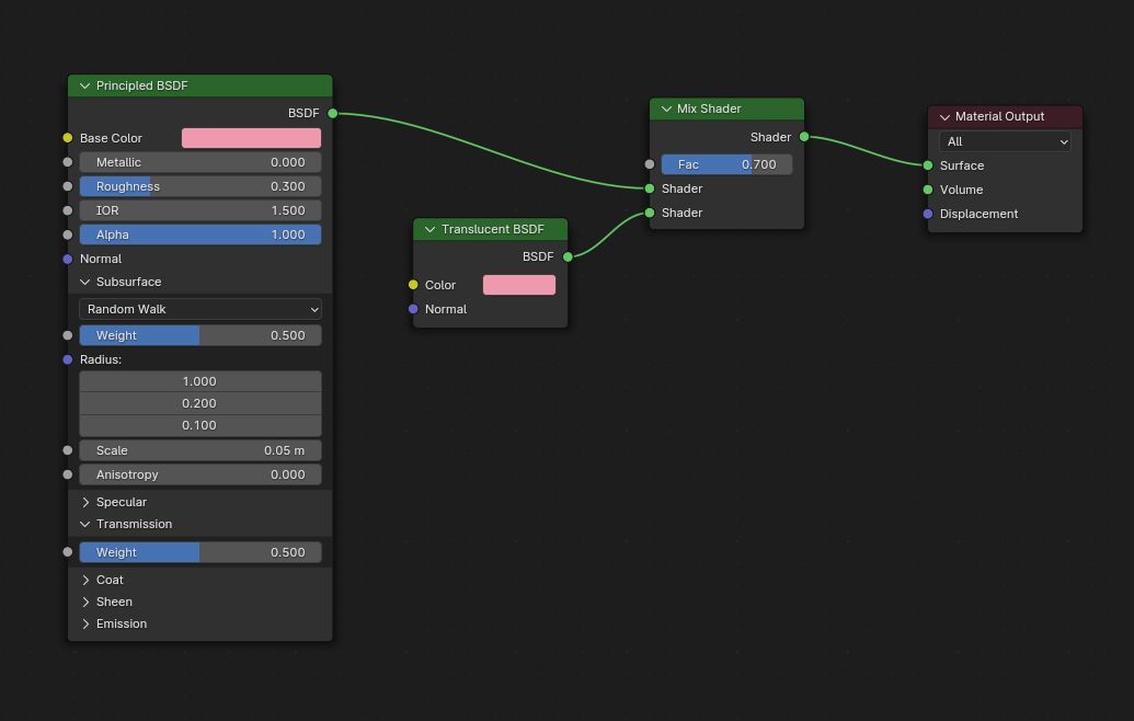
lid material

And these are the resulting renders:

laneige lotion jar

For me personally this would be good enough, but of course there are lots of ways to tweak here and there to get it better. Another thing than the material itself is of course the environment/lighting, it can make everything look completely different (see my examples of a simple gold material under different HDRIs in my answer here: How to make a liquid gold texture)

One thing which is often important when creating a glass material to make it look good are the light bounces. People tend to have low numbers of bounces, however especially with a glass material the glossy bounces are important - inside the glass, between the "walls", the light can bounce around very often. With a low max bounces value, this often leads to dark areas in glass objects.

I would recommend going to the Scene Properties > Light Paths and under Max Bounces set the value for Glossy to at least 16. Higher values might improve the look, but not necessarily. Beyond 32 it is usually hard to notice a difference.

For Transmission (and glass is a transmissive material, not transparent) I would recommend a value of 64. This way you make sure that even more complex glass sculptures or things like that do not have parts where you cannot see through anymore because there are too much layers.

A Volume value of at least 1 instead of the default 0 will be good too, otherwise using the volume in the glass material might look bad (but it is not necessary when you use only the Volume Absorption node).

Now you only have to make sure to set the Total bounces to the max value you have there as well, otherwise it will clip those values to the total number of bounces while rendering. The thing is, many tutorials suggest to keep all bounces low for render times and that's why many people think the standard glass material in Blender is not so great. But it just looks much better with higher values and actually it doesn't even take much longer to render. By the way, my Transparent value is set to 128, that's more than the Total value but this one is independent from the other bounce values. It is used for alpha transparency and also for volumetric materials (like smoke simulations).
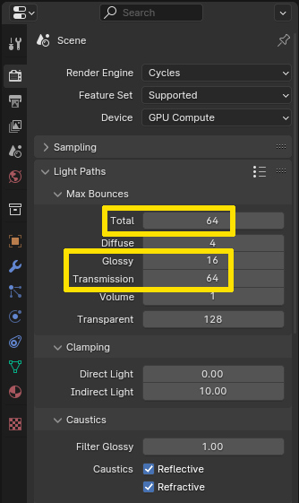
max bounces

Last but not least, my blend file:

$\endgroup$
4
  • 1
    $\begingroup$ your model and materials are excellent! I will study your comment + blender file (thank you so much for sharing it with me!) Not sure if this conversation is allowed but if i wanted to learn Blender the 'right' way, how should I go about it? I watch youtube videos as much as possible and i started a couple of months ago. Would you recommend to continue using Youtube tutorials? Thank you again! $\endgroup$
    – Der8
    Commented Apr 26 at 15:17
  • $\begingroup$ Even the font is so good! I really struggled with it. $\endgroup$
    – Der8
    Commented Apr 26 at 15:23
  • 2
    $\begingroup$ @Der8 I learned mostly from tutorials, so yes that's definitely not the worst way. The rest is learning by doing, playing with settings and see what works best. Trying to understand how things work and drawing conclusions from that how to tweak settings. And for some tutorials: thinking the shown method/explanation cannot be the best/correct way and trying to find a different or better way. Conversations are not so good here... $\endgroup$ Commented Apr 26 at 15:52
  • $\begingroup$ I completely understand, thank you again! $\endgroup$
    – Der8
    Commented Apr 26 at 16:02
3
$\begingroup$

i personally think, you make it way tooo complicated.

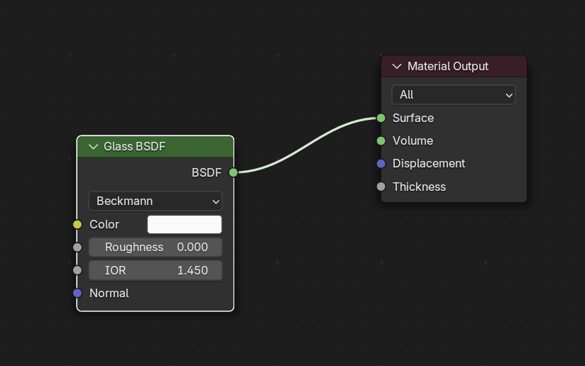
Glass can be very easy rendered with the "perfect" material: glass.

enter image description here

But...you have to use cycles so that it really looks good.

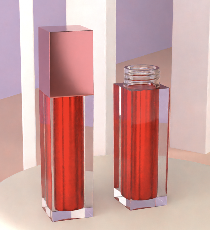
result looks like this:

enter image description here

by the way: i "stole" the image from BlenderKit (free add-on) which has tons of models, scenes, materials where you can learn from.

I would guess that the bottom part is just glass, but the filling is another color. So i would model a filling (the model in Blenderkit did that as well):

enter image description here

and with the easiest material possible:

enter image description here

and i think, it looks great.

Just make sure the glass and the filling won't overlap.

Rest is lighting. I would watch some beginner tutorials for that...or....you just use the delivered free add-on enter image description here to light it.

$\endgroup$
3
  • $\begingroup$ My thoughts exactly! I think the OP makes it way too complicated. I do not know why so many people avoid using the Glass BSDF when they want to do glass. It's all a matter of the right settings and also the right lighting/environment. The Principled BSDF with Transmission = 1 is good for glass too, I also like that it allows to set a surface roughness and a transmission roughness (which can be very different in reality). But often I do not color it very much at the surface and do this additionally in the volume, because colored glass is often imbued and not just coated with color. $\endgroup$ Commented Apr 26 at 6:56
  • $\begingroup$ @chris thank you! I hadn't heard of these add-ons, they seem very helpful! Using glass bsdf with default values seems off to me somehow. I saw the bottle again (I actually own this product), the body and the base are one single object but the bottom/ base has a bevelled and indented bottom. (I'm adding a link to a YouTube video although I'm not sure if it'll be helpful.) Thank you again for all the helpful info! $\endgroup$
    – Der8
    Commented Apr 26 at 7:00
  • $\begingroup$ Edit: Tweaking the roughness in glass BSDF has helped! $\endgroup$
    – Der8
    Commented Apr 26 at 7:08
3
$\begingroup$

I think there are few important things when it comes to any transparent/translucent materials:

  • Shape of the geometry is way more important than it might seem.

  • Environment and lighting is way more important than it might seem.

  • Observing reference is very important. You should have it on screen when working(PureRef is great for that)

As soon as you have good lighting and detail geometry it all just comes to playing with PrincipledBSDF shader until it starts looking similar to your reference:

enter image description here

This is just an example. The more time you spend on it, the better it tends to get.

$\endgroup$

You must log in to answer this question.

Not the answer you're looking for? Browse other questions tagged .