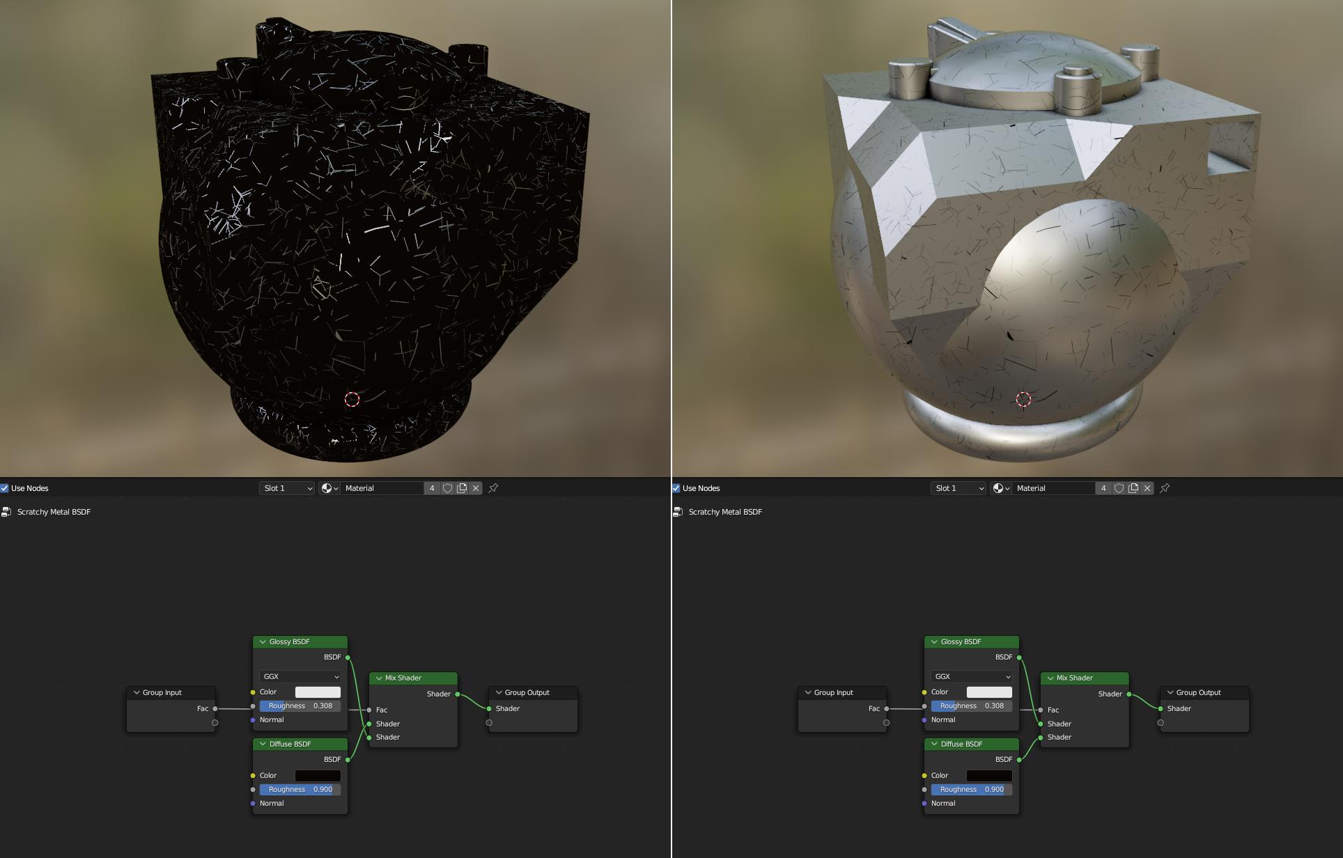
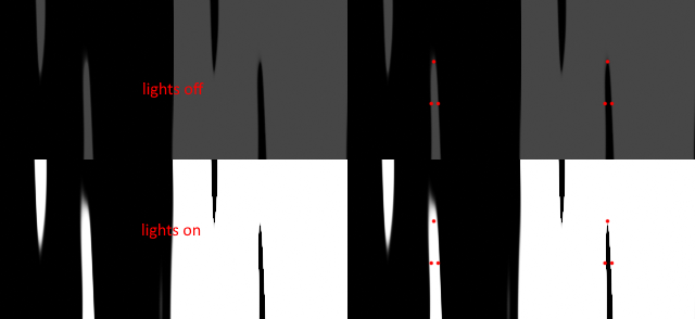
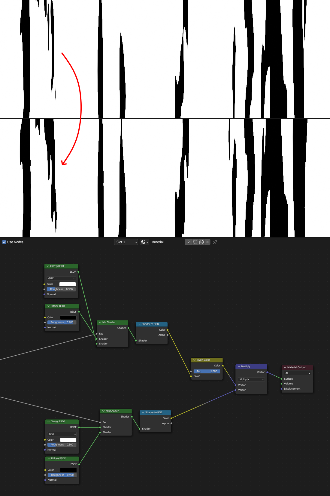
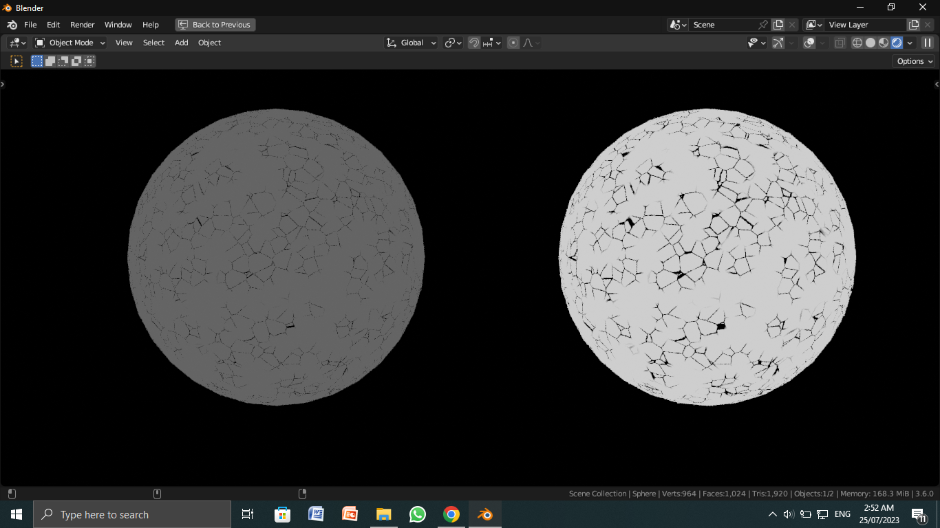
For the technical part, make sure the scratches are visible more by simply increasing their size. And as Markus pointed out in the comments, use the color ramp set to constant mode.
The relative values of colors with each other can highly change the final appearence of something.
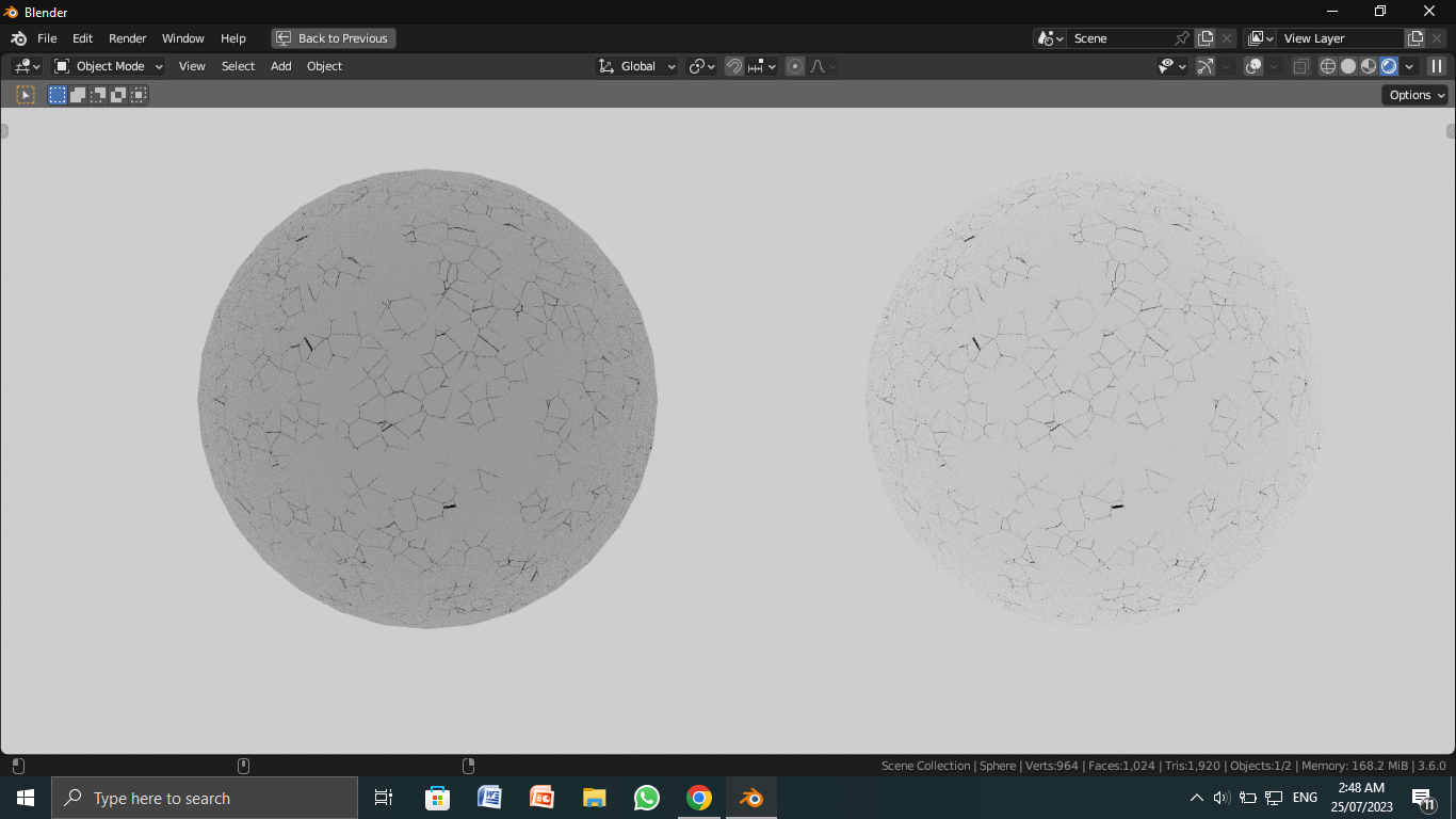
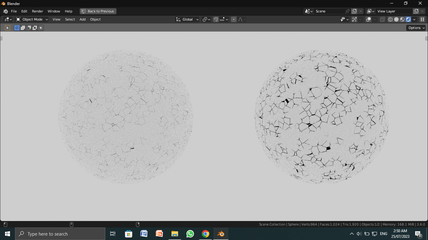
Look at the pictures that I have given below.
In the first one, the background is light, and the two spheres,one has a dark color and the other a light color.
You can observe that the scratches are more prominent on the light. This is because the contrast is much more.

In the second one I have simply increased the size of my scratches and thus making them more visible (increase the value in the less than node)
 Now compare this 3rd image with the first one. You may have understood what I am trying to say by relative values of the colours.

Basically what I think is that the glossy shader, since it's a bit greyish, is not giving you enough contrast. You don't have to change the glossy shader to something else though. Things like lighting can provide you more contrast very easily. Just be careful about the fact that the reflections are a bit clear since it's glossy and your light may appear.
Another thing, if you mix a some texture containing some grey values, and use multiply to combine the both, your beautiful, no gradient, sharp edges(scratches) will dim out according to the texture you are mixing with. Use different color blending modes for proper results.

