5
$\begingroup$

How can I get more saturated colors when I render? An image comparison is worth about a thousand words.

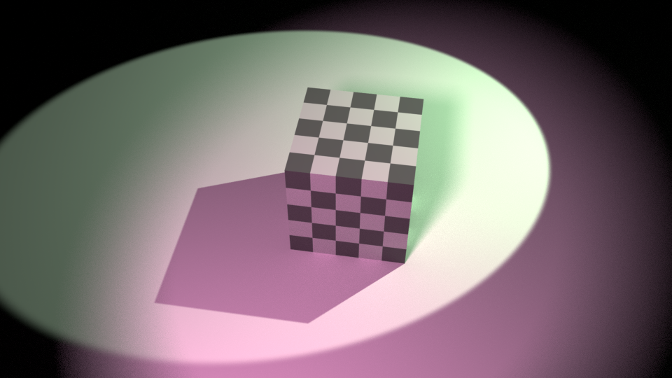
Take this raw render as an example:
image straight out of blender

But then when I tweak it in photoshop I can get this:
colors boosted in photoshop

See how dull the render is? (looks really bad right on top of the edited one)

What do I have to do to get the render to look more like the edited image?

I have heard all the common knowledge about never using colors that are too saturated or have a pure value in materials or lights, but when I keep my values too low I end up with dull images (as seen above). For reference the two lamps in that image have a saturation of 0.2, and a value of 1. Their strength is 400, and 500 for the green one.

Here is the blend, so you can dissect all my settings.

I have read How to get accurate colors with Filmic Blender, but that question is different. I'm not asking why my renders look dull compared to a non filmic color transform, but rather what should I do to make my render look vibrant "out of the box."

Is there some sweet spot with the Exposure and Gamma controls in the Color Management section that will yield more vibrant colors? Or are renders always expected to need some tweaking?
Or should I simply use more saturated colors in my lights?

$\endgroup$
3
  • $\begingroup$ Using more saturated colors is certainly expected to help. I guess that advice stems purely from the photo-realism point of view, since in nature no light source or surface is ever really fully saturated. If you are indeed looking for more vibrant colors at the expense of "realism" I suppose it could be discarded or at least partially ignored. I assume you are looking for answers not involving any type of post processing or compositing in the node editor, right? $\endgroup$ Commented Dec 13, 2017 at 2:34
  • 3
    $\begingroup$ "never using colors that are too saturated or have a pure value in materials or lights"... rubbish. If you want saturated colors... then use saturated colors. Also, what's killing your contrast is the relationship between the brightness of the lights and the value for the world. Bring that one down. $\endgroup$
    – user1853
    Commented Dec 13, 2017 at 4:47
  • $\begingroup$ i.sstatic.net/44gH3.png $\endgroup$
    – user1853
    Commented Dec 13, 2017 at 4:54

4 Answers 4

7
$\begingroup$
  • Watch your albedos. It doesn't matter if you use pure primaries or highly saturated colours; Filmic will desaturate as things get too intense. High albedo will race those values through the roof quickly, leading to desaturation. As Cegaton wisely said, the old adages are pure rubbish based on a lack of understanding regarding view transforms; feel free to use as heavily saturated colours as you want when designing your looks for textures.
  • You can't have an object that is highly saturated and highly intense. It is simply impossible. Colour is a byproduct of the ratios of the three lights, which means that as the intensity increases, the room for those ratios become more and more limited. Find the sweet spot keeping your colour within the exposure range.
  • There is an intimate relationship between the apparent saturation and the contrast. Try to be delicate with contrast adjustments that focus on the saturation you desire. For a fulcrum based contrast tweak around middle grey, divide your render by 0.18, use the power function of the CDL, then multiply by 0.18 on the other side. This will adjust contrast based around the middle grey point as a fulcrum.
$\endgroup$
1
$\begingroup$

I hope I understood the question correctly and I'm not missing something here. To be clear, this isn't my area of expertise at all, but from 5 minutes in your file I achieved similar results to the photoshopped image above by using the settings in the Color Management panel.

The first thing to do is enable curves and adjust the Black and White levels. It's the same thing that you would do when using the RGB Curves node to color correct an image. Basically you set the Black level to be the color of the darkest pixel in your render, and the white level to be the color of the brightest pixel. This makes the darkest pixel now black, the brightest one white, and adjusts the colors in your render to take that into account. This alone can give many images the extra 'pop' they need, but the downside is this step is image dependent.

Here is the image before and after this step:

enter image description here enter image description here

Depending on the look you are going for, you can manually adjust the curves to add some extra contrast or achieve a certain look.

To avoid having areas that looked way too bright, I added a single point in the center of the curve and moved it down a bit. I only made subtle changes at this step because they worked best with the final step I did, but you can easily get more extreme results.

enter image description here

Finally, and this may be the only step you need to get a more saturated image, I used one of the "Look" presets. To get a result that was as similar to the one you are going for as possible, I used the Kodak KAI-0311 preset (there may be better as I didn't go through all of them). I ended up with this:

enter image description here

Based on the presets I tried, a suitable result can probably be achieved with just the 'Look' (using something like the Agfa Agfachrome CT Precisa 200 in this case). Some adjustments via curves may be needed as most of the Look presets seem to cause the entire image to be brigher. However, based off of the tooltip, it would appear that this is not the most realistic way of achieving the result you are looking for, although I can't say whether or not that is true.

This was all done using the Default View. Based on everything I've read, using the Filmic view would give better results, but I tried to keep everything as 'default' as possible.

$\endgroup$
1
$\begingroup$

This is a pure render, only disabling world and cranking up the lights saturation.

enter image description here

$\endgroup$
0
$\begingroup$

In my case the default was Filmic (that is supposed to be more photorealistic, but I don't care about photorealism). I moved it to Standard, and I directly got a huge improvement in term of saturation.

$\endgroup$

You must log in to answer this question.

Not the answer you're looking for? Browse other questions tagged .