2
$\begingroup$

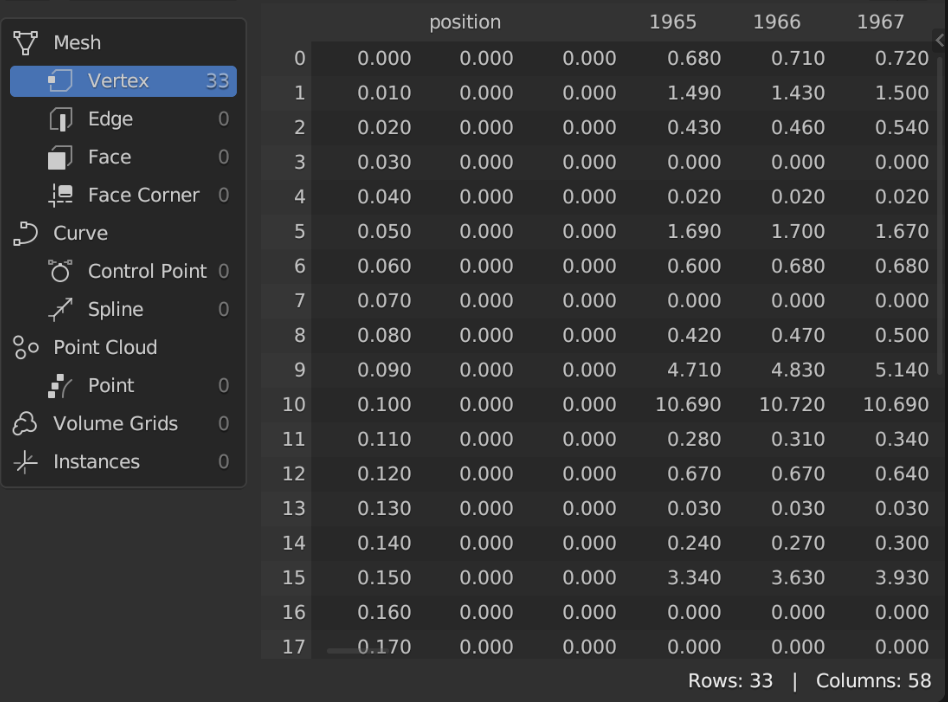
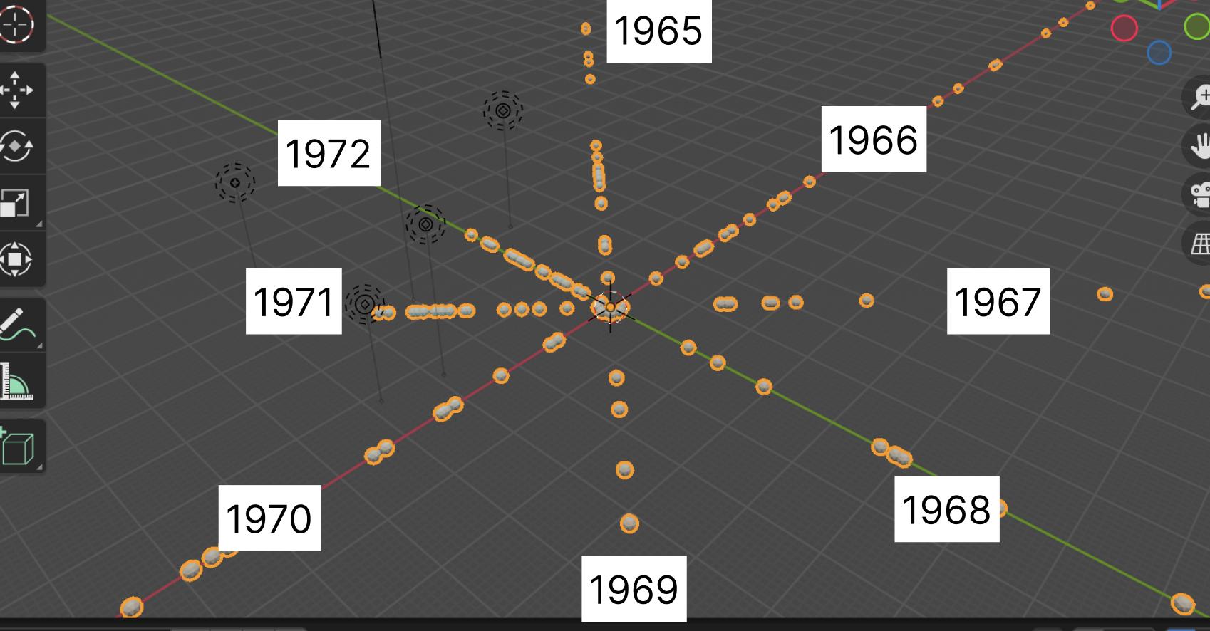
I'm working with different datasets imported to Blender and am trying to create a data visualization for each year from 1965 to X year. The years are the attribute index and each year has its values. My idea is to create kind of like an "atom" view so I distribute each year around the circle and the instances are visible in their own line depending on its values.

So I'm wondering if I can get ideas on how to distribute the years around the circle dynamically using Geometry Nodes. For example, if I have 10 years in the spreadsheet, they are automatically arranged (rotated) around the circle, and same if I have datasets with more years.

My idea is to use some node in a similar way the "Count" is on the "Curve to points", so each year (named attribute) is connected and rotated around clockwise. Of course, I couldn't accomplish this.

Thank you in advance!

spreadsheet

visual idea

idea

$\endgroup$
4
  • 1
    $\begingroup$ Completely BTW, of course, you will have your reasons.. But the representation of serial data as segments of a circle is .. unusual, and open to misinterpretation. A segmented circle would normally suggest unordered, or possibly cyclic categories. (BTW BTW ..IMO, Edward R Tufte: The Visual Display of Quantitative Information is an absolute classic, and should be in every graphic designer's collection.) $\endgroup$
    – Robin Betts
    Commented Sep 2, 2023 at 8:00
  • $\begingroup$ @RobinBetts not that either the Q or A are good examples of that, but in many contexts time is cyclic, for example here's a video of the global temperatures calculated by NASA: climate.nasa.gov/climate_resources/300/… $\endgroup$ Commented Sep 2, 2023 at 9:22
  • $\begingroup$ Hi, Markus ( My comment is definitely off-topic, but my inner geek gets so mad with badly-represented data.. I have no idea whether this is an example. maybe not at all.. maybe perfectly fine..) The NASA data are cyclic..so the representation is entirely appropriate, and informative. They've also followed one of Tufte's other guiding principles: imagine ink is very expensive, and use as little of it as you can. $\endgroup$
    – Robin Betts
    Commented Sep 2, 2023 at 9:38
  • $\begingroup$ A solution with nodes only is possible in Blender 4.0 using repeat zones, but it's an Alpha version to this moment, and I don't know if answers using non release versions are valid. $\endgroup$
    – Hulifier
    Commented Sep 2, 2023 at 19:38

1 Answer 1

5
$\begingroup$

We need to prosecute the guy, who created the addon loading data into named attributes… It's useful, but it's also a noobtrap, leading inexperienced people into unnecessarily hard workflows. One simple and effective way to load data is to create a mesh and set its vertex positions to the data, see here and here.

For example, let's take the data of BSE activity:

Is there data available on the amount of questions posted over time?

Save the .csv and convert it to a mesh:

from bpy import context as C, data as D

with open("E:/QueryResults.csv") as f:
    lines = f.readlines()

list_1D = []
    
for line in lines[1:]:  # example: "138","5","2013"
    list_1D.extend(map(float, line.replace('"','').split(',')))

me = D.meshes.new('data_mesh')
me.vertices.add(len(list_1D)//3)
me.vertices.foreach_set('co', list_1D)
ob = D.objects.new('data_object', me)
C.collection.objects.link(ob)

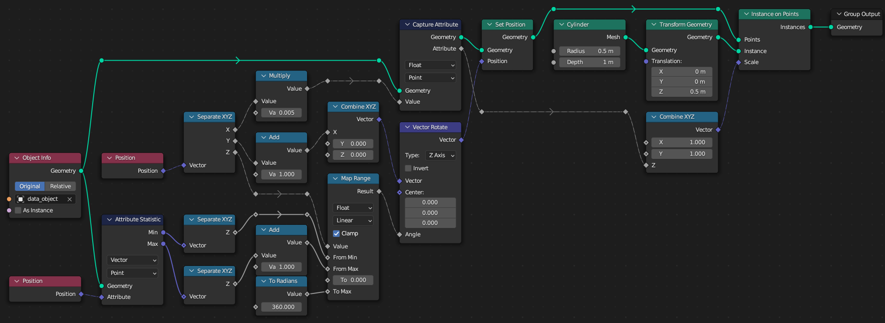
The code is minimal, since this is a geonodes, not Python question, so the logic is moved to nodes:

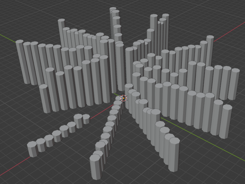
And the effect is a 3D chart, with each cylinder representing a month: cylinders are grouped in year-lines, ordered counter-clockwise starting at $+x$ line for the first year, and the cylinder height is the BSE activity on that month:

$\endgroup$

You must log in to answer this question.

Not the answer you're looking for? Browse other questions tagged .