3
$\begingroup$

The one to the left is inspiration and the one to the right is my project with faild lightning

I’m trying to recreate the look of the 3D image on the left (see image) with my project, which is shown on the right. I believe they used a Sky Texture, and that’s the approach I’ve taken as well. However, the Sky Texture in my version gives a slightly yellow tone. I want it to look more naturally gray, like the image on the left.

I’ve tried different settings in the Sky Texture, but I can’t seem to get rid of the yellowish tint, even though the sky appears blue. I have raised the Sun Elevation and Ozone but I do not work as I want. Is there a way to make my model look more like the one on the left in the picture using the Sky Texture?

$\endgroup$
5
  • $\begingroup$ Try to put zero strength on the sky sun and create your own sun light object. $\endgroup$ Commented 14 hours ago
  • $\begingroup$ You didn't share the same file as the one you show, but have you tried the Color Management > Standard instead of the one you've selected? $\endgroup$
    – moonboots
    Commented 14 hours ago
  • $\begingroup$ @DanielMöller I set the Sun Intensity to 0 and created a custom sun, and the result turned out better! I'll experiment with different settings to see if I can make it more closely resemble the inspiration image on the left. Thanks for the tip! $\endgroup$
    – David
    Commented 14 hours ago
  • $\begingroup$ @moonboots The file was just an example since my scen is to larage to upload here. If I select the Standard option instead of AgX, the colors become too bright and appear unnatural. $\endgroup$
    – David
    Commented 14 hours ago
  • $\begingroup$ Note that the image on the left has a subtle vignette, which may be affecting your perception of its color. In reality, the majority of each background is very close to neutral grey. $\endgroup$
    – Vaelus
    Commented 6 hours ago

2 Answers 2

5
$\begingroup$

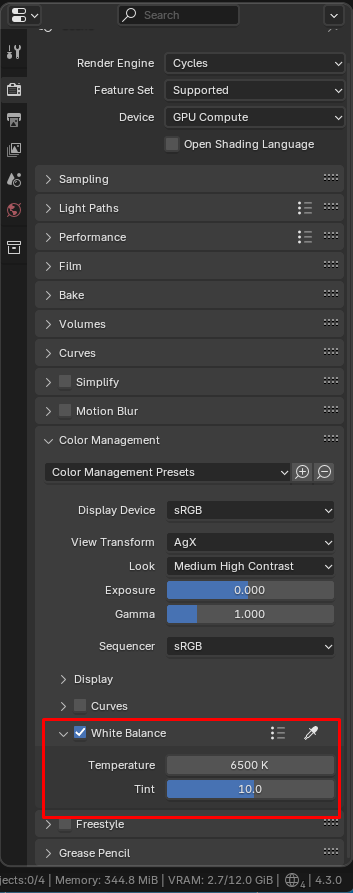
In most cases you might care about light source colors/temperatures in relation to each other, so it might be convenient to set them up using known temperatures/colors(like in this case sun and sky colors determined by the sky texture) and then adjust the white balance of the whole image. That's what happens in real life when you take photos. Lighting has some particular colors and cameras adjust to that(often aromatically). In current Blender version 4.3 there is now a possibility to adjust white balance in the Color Management panel in the Render tab of Properties editor:

enter image description here

You can adjust blue/yellow tint with Temperature and Green/Magenta tint with Tint property just like you would do in photo editing software. This will affect the output image uniformly though, so all lights will get affected. This is what you most likely want to do in your specific situation you described.

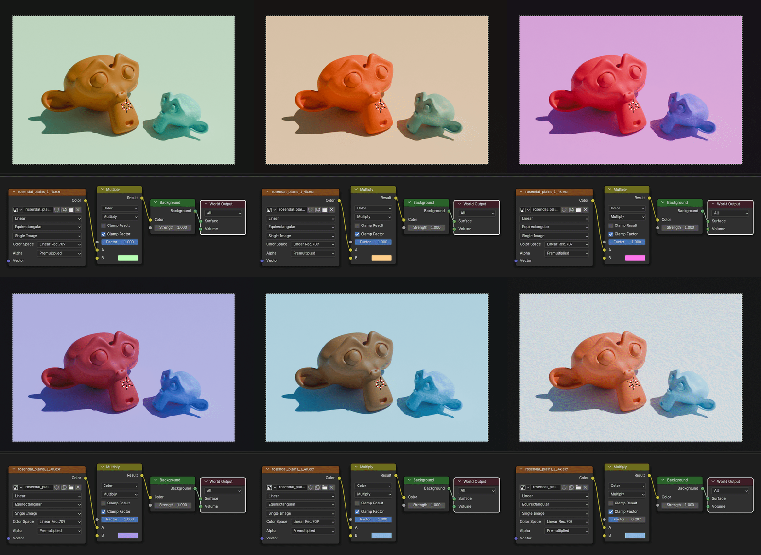
Whatever texture you are using, you can also add any color you want to it with nodes(you would add more blue if it's too yellow):

enter image description here

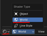
(Shader editor, World mode)

enter image description here

That's Color Mix node in Multiply mode. You could use other color adjustment nodes to modify the colors of your world texture as well like Hue/Saturation/Value or RGB Curves.

If you wanted to adjust white balance of your HDRI lighting or sky texture only, you cold multiply it by Blackbody temperature color using the same Color Mix node in Multiply mode:

enter image description here

$\endgroup$
1
$\begingroup$

I do not believe they used the Sky Texture for the world at all, as simple as that - unless you have further information about the scene pointing to that.

I think it is just a plain color for the sky (it does not seem to have much of a tint in the shade, perhaps a slight blue) and some light/lamp. Just as @DanielMöller suggested, you can put your own sun in the sky. However then you could just as well completely remove the Sky Texture and make it only a color as I said.

The other thing is, there is a brightness falloff in the image, the central part with the buildings is the brightest and completely colorless, just greyscale (apart from roof color and indoor lights), then it gets darker towards the outer area and the background with a blueish tint, as you can see when boosting the saturation - while your image has not only the orange tint, but also no noteworthy falloff exactly like a sun lamp would not have.

And this would suggest that the original scene might not even have a sun lamp or at least it is not the only light, as this falloff is most likely caused by a point, spot or area light. Or they used a sun lamp and put some kind of vignette over the image in the Compositor to set the focus on the central part.

This is the oversaturated image revealing the blue tint and either a light falloff or a vignette, which could also mean the sky is just the default grey and the vignette has the blue tint:

oversaturated comparison

Setting the contrast to a very extreme value also reveals that there probably is a vignette on the reference image:

high contrast

$\endgroup$

You must log in to answer this question.

Not the answer you're looking for? Browse other questions tagged .