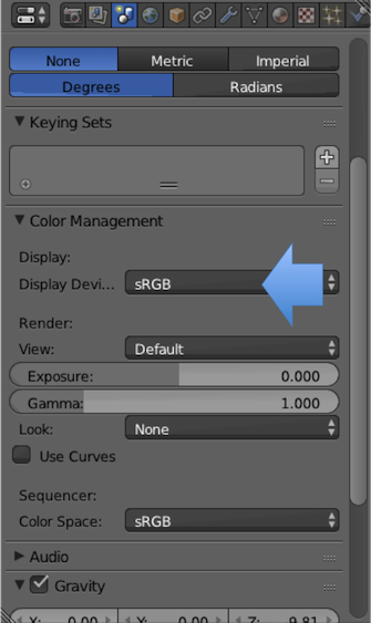
Edit: Note this is an ancient answer, pre-Filmic Blender. The TL; DR version is that you must always pixel manage everything. Do not turn transforms off, and appropriately tag your buffers.
No matter how many times I try to read about color spaces, I always
feel like I've walked into a movie 45 minutes late.
Don't feel too bad as there is so much misinformation out there and confusion that many artists end up following what amounts to digital alchemy rituals in order to get things right. The best advice I can give you is to figure out who you believe you can listen to, and ask as many questions as you can until the subject is absolutely clear. Your work will most certainly be elevated once you manage to grab onto the rather slippery subject.
Since I'm looking at Blender with a computer screen which presumably
already has a limited color space (compared to human vision) why would
I want to push a button that at least appears to limit it even
further?
This is a seemingly simple question that has a massive set of roots under the surface. The TL;DR is that if you don't enable sRGB, the result is wrong.
I like the colors I see when sRGB is turned off, but should I be using
it anyway?
TL; DR: Yes.
Since you took the time to ask the question, I'll do my best to try and give you an entry level conceptual framework to work with. Hopefully it will aid your understanding and help you grasp a little bit more about colour and its management.
Two Sides to Colour
At the core of colour and how it is encoded into data are two loose concepts.
The first is the colour of the light, or in colour nerd terms, chromaticity. When we think of an RGB triplet of data, we have to ask ourselves what the values mean. RGB data is merely an arbitrary numerical representation of three primary lights for each of the red, green, and blue channels. If I were to say "Hey, grab a flashlight in your house that looks red and turn the slider up to 0.8-ish.", that is roughly what we are communicating when we fail to use colour spaces and colour management; we are communicating absolutely nothing.
Without associating the RGB encoded values to a colour space, we are speaking gibberish. We know nothing about the actual colour of the light on your flashlight, nor do we know what the heck 0.8 means in any meaningful representation.
In addition to the chromaticities of the primary lights, we also have what is known as a transfer function, sometimes erroneously called "gamma." This is a term that describes how the values relate to each other in intensity, where the ground truth is a radiometrically linear quantity of light in relation to a scene or a display’s output. 0.8 in our example above tells us absolutely nothing about how intense the value is in relation to the other values because we don't really know anything about the encoding system used nor how the transfer function is defined.
Colour Space
To solve the above issues, we need more information than purely the relative RGB data. We need to communicate what the values actually mean in relation to some known standards or ratios. If we know what the colours of the primary RGB lights are in absolute terms, what the transfer function ratios are for the data, and some other aspects, we could call that combination of variables a colour space; an encapsulation of a bunch of additional data not communicated with the relative RGB encoded data.
sRGB is one such creature. sRGB has very clearly defined absolute chromaticities defined for each of the red, green, blue channels, as well as a defined white point. It also includes specifications for the transfer function. These facets allow us to 'decode' the RGB values in an image and properly communicate their intention and handling through a pipeline.
Why Linear?
So what does Blender have to do with all of this and why the hell do we see "linear" somewhere and what is sRGB and why? Why? WHY?
The answer to this is rather simple. In practical terms, Blender is completely blind to the colour of the lights (see chromaticity above) and merely worries about performing math on the data values. Cycles, however, is a ray tracer and attempts to, as best as it can with a tri-colour or tristumulus model, emulate real-world physics when it comes to rendering.
Real world physics is pretty simple when it comes to math. One unit of light plus one unit of light is, in shockingly, two units of light. Energies operate in a linear fashion, and as such, they behave very rationally.
sRGB on the other hand, for various historical reasons and circumstances, is a non-linear colour space. That is, the transfer function portion of the colour space is bent in such a way that the values are not linearly related. 0.4 plus 0.4 in sRGB is not twice the radiometric amount of light! To see a quick visual effect of this non-linear nasty math, fill up a background in your favorite imaging application of full green and full blue for a cyan colour. Now take a fuzzy fully red brush and paint across it. See the nasty fringing? That is a result of bad and broken math due to a nonlinear reference space.
When you load an image in Blender, it is rolled through OpenColorIO. OpenColorIO is the library that handles and tracks all of the colour space related complexities. The goal of OpenColorIO within Blender is to make sure that the reference mixing space is always linearized such that Cycles can perform proper math for the imaging.
Phew
So why sRGB? If we use a linearized reference space, and we were to dump those linear values direct to the display, our display's output would look wrong. In particular, it would look extremely dark because we haven't properly "corrected" the values back to a nonlinear response. When we select sRGB in Blender, we are telling the program to roll the linearized reference data back out through the correct nonlinear sRGB transfer curve.
If we don't do this, the data is entirely incorrect for storage in a JPEG, a TIFF, or other such nonlinear wrappers. It is also completely incorrect for viewing.
So when you are entering your values, you need to be certain whether you are entering tone response curved values or linearized values, and be absolutely careful at which point in the pipeline you are entering them. An image loaded from a JPEG would need to have its display referred non-linear data properly linearized to display linear before use.
If you mix and match the values without care, the visible representation of the values will not match what is 'expected' from other applications that are likely using nonlinear sRGB values.
This is, despite being a long winded bunch of rubbish, only the tip of the colour space iceberg. There's so much more to expose yourself to that will almost certainly be interesting to anyone creating visuals.
I hope I didn't lose you, and I hope you manage to understand why you should be using that odd sRGB viewing transform. I also hope you try to learn a little more about the rather vast subject of colour management.
Addendum
This answer was provided in the context of the default set of transformations present in Blender. The answer tackles "Should there be a transform between the scene referred data and the display referred output?" abstract question. To this end, the answer is provided in that context. If this is of interest, researching the various transforms that can be used to elevate scene referred rendering and imagery would be useful. There's more than a few of those out there now...


