Cegaton has wisely hinted at the root of the discussion, which is that the framing and definition as to what is an accurate colour is a cause for much confusion and much misunderstanding. This is an answer that is long due in coming, and hopefully it will help elucidate some of the core concepts behind colour that might help in ascertaining a fleshed out solution.
This answer will not cover the complex notions behind albedos and other rendering nuances that are a part of this massive question.
What is a colour in a three light encoding model?
It is crucial to identify some sort of ground truth when discussing colour. Without getting into the nitty gritty colour science stuffs, we need two bits of knowledge to ground ourselves:
- RGB is a relative encoding model.
- All colour is anchored in the CIE 1931 experiment and model known as XYZ.
The former means that without utilizing the latter, the values in an RGB triplet are meaningless. The latter is our means of discussing colour accurately and scientifically. You can think of the CIE XYZ model as nothing more complex than another three light system, but with a concrete, scientific and absolute reference point. Where three random RGB values with no metadata are meaningless, three XYZ values are always well defined and absolute.
Harnessing the power of the XYZ model allows us to take the relative values from some well defined RGB triplet and convert those into meaningful values across all colour spaces.
How does a colour become unique in an RGB system?
A colour is defined by defining an intensity value for each of the three colours of the three basis lights. That is, each of the red, green, and blue basis primary lights have clearly defined and unique colours relative to CIE XYZ. A few rules of thumb apply to these basis primary "flashlights":
- They never change their absolute defined colours relative to the CIE XYZ model, only intensity.
- The range of colours that can be mixed is defined by ratios of these three basis primaries.
- Bit depth does not change the colours of those basis flashlights.
- Physical hardware determines the colours of those basis flashlights when dealing with the physical domain.
Key takeaways:
- Ratios of the three basis primary lights are what defines a colour.
- Basis primary lights aren't subtly different for different colour spaces, but rather radically different in both hue and saturation to borrow common application terms.
What is a colour in Blender?
In Blender, the internal reference space is configured via the OpenColorIO configuration. By default, it is based on REC.709 lights. REC.709 is a specification that clearly defines three primary light colours. This is the same colour of basis primaries that are referenced in the sRGB specification, and also very likely the colours of lights in the pixels that one looks at when looking at commodity display hardware. Modern televisions, Apple devices since 2015, digital cinema projectors, and a number of other more contemporary devices do not use the same coloured primaries.
When you render with Cycles, using Filmic or the "default" transforms, the internal reference primaries are always REC.709, as implemented via the OpenColorIO configuration.
Why do some colours look different when rendered under Cycles versus the "default" transformation if the reference primaries are identical?
Here is where we get into the complexities as to how a view transformation will alter the visual output on identical data. Consider the following display referred images. These were all "rendered" from identical scene referred starting points. That is, the underlying scene referred data was identical in all cases, and only the view transform was changed.


Note that in the above images, the two view transforms used were Filmic and "Default", which is the sRGB OETF.
Obviously there are clear differences in the dynamic ranges addressed within the encoded GIFs. But look closely at the actual colours in the imagery. What you'll see is that two colours, despite being generated from the original values, are entirely different.
If we look at the mountain GIF, we can clearly see:
- The sky blue in the Filmic version is much more cyan in the sRGB OETF version.
- The trees are blowing out to a pure yellow under the display referred sRGB OETF transform.
- The colourful stained glass is losing the intended ratios across a range of colours under the sRGB OETF transform.
Why do colours look so different when comparing Filmic to the sRGB OETF variant?
If we remember above, we learn that what defines a colour is the ratio between the channels. For example, a pure REC.709 red primary would be expressed as 0.01, 0.0, 0.0 or 123123.34, 0.0, 0.0 or 0.8938, 0.0, 0.0. In all three examples above, the resultant output, although differing in intensity, would always have precisely the same colour. In colour science terms, we could say that the colours above would have identical chromaticities. Again, as per above, this means that the colour the values referenced are absolutely identical in terms of chromaticity according to the CIE 1931 XYZ model.
So what is happening in these sample images? Why are the colours so different?
The sRGB OETF is a hard cut view transform that was never designed for rendering. Ray tracing engines generate scene referred, zero to infinity values. This is the same value range according to HDRIs and other scene referred image encodes.
When we consider that the blue in the mountain range GIF is a ratio of the three primary light channels, we begin to see the problem; the sRGB OETF isn't showing you anything even remotely close to the intended colour. That is, if we consider the ratios between the scene referred source data, and the ratios expressed in the display referred output, the resultant colour (again, chromaticity) bears little to no semblance to the intention expressed in the original ratios.
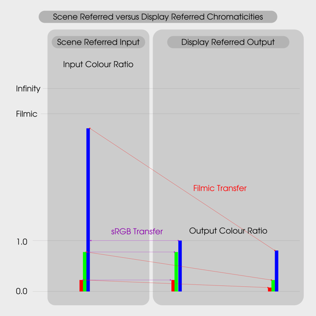
Here's a simple image to demonstrate why:

The above image ignores the complexities of the transformation from the scene referred to display referred model, and instead provides the values as 0.0 to 1.0 on an aligned scale.
While some folks erroneously think the above differences are purely a saturation issue, the effects are actually much deeper. While the ratios are purely a fictional example for a single pixel, one can get a clear idea why the output ratios under the sRGB OETF are inappropriate and entirely inaccurate for a scene referred image. The original intention of the ratio expressed by the REC.709 primary lights is entirely incorrectly expressed.
The colours are completely wrong in the sRGB OETF version.
Once we realize that a colour in a three light system is a byproduct of the ratios of the three lights, we can understand what a correct colour is. In the above examples, a default hard cut will distort the ratios of the intended colours, leaving incorrect colours displayed. The cyan in the sky of the mountains? Incorrect colour ratios. The yellows in the leaves of the background trees in the tree image? Incorrect colour ratios. The magenta and reds in the stained glass? Incorrect colour ratios.
What most folks have been looking at all along via the default transform isn't "more saturated", isn't "more accurate", but plain and simply incorrect colour ratios that have long since lost the intention of the original ratios.
Moving forward
Filmic tries to get a closer representation of the original intention of the scene referred ratios. It does so in a manner that is much more close to what the intention of the original values are. That said, there is further room to improve on the result using more complex colour models and colour science. Hopefully the next iteration will demonstrate this, as well as other fancy and interesting things such as wider gamut rendering etc.
It is hoped that this answer isn't too sufficiently complex for a casual reader, and that the information provided herein makes enough sense to help folks use better language when discussing colour, as well as explain some of the qualia differences between their render versions.
It takes a village.


