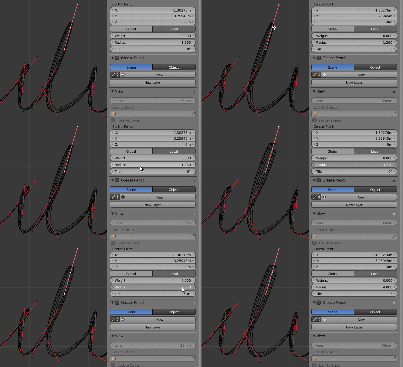
There's a nice tutorial here showing how to get such an effect by tracing a real text object and creating a cruve from it. https://www.youtube.com/watch?v=QUVUR9jupMY
The problem is this makes all the text lines be the same thickness which is unnatural for handwriting. There's a trick mentioned in the tutorial which is having a plane behind the text curve and moving the sections of the curve you don't want to see behind the plane which could also be used to make same section of the curve less thick but that would take very long to prepare. Is there a less time consuming way to do it?


