While this isn't a fault with blender's font parser I think I can offer some insight.
To give this context, this doesn't only happen with fonts, it happens with all 2D Curves that self intersect when offset too.
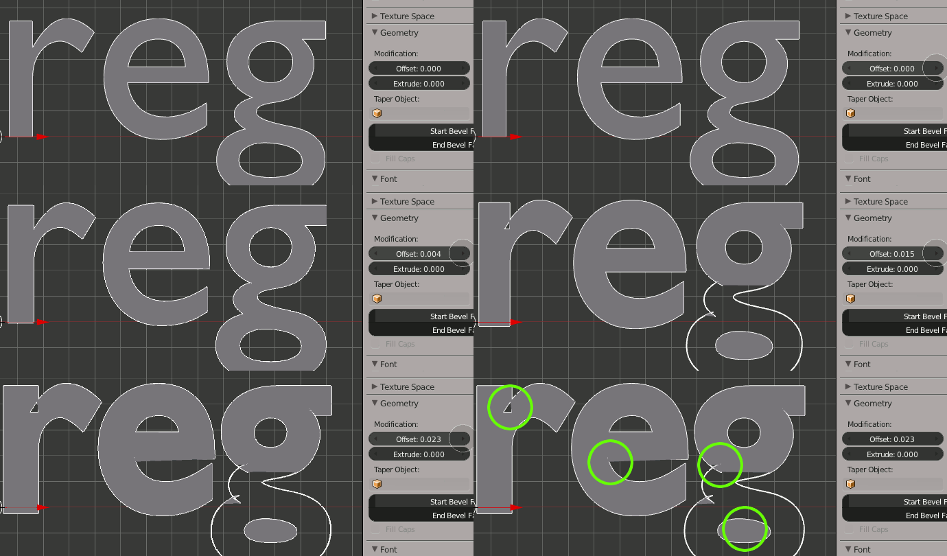
Font Weights
If you have a bit of respect for typography then you don't 'fatten' fonts. Fonts are designed with certain visual weights in mind, an indiscriminate offset messes with this delicate balance of geometry and empty space. As an example Helvetica has between 34 and 51 weights depending on flavour, each is 'fattened' by hand and tweaked in subtle ways.
No doubt you don't have to pay any attention to what is considered proper use of fonts, that's part of the fun. For the moment this is the way the Blender engine offsets 2D filled curves, without respect for potentially self-intersecting geometry. If you really want fatter letters but can't find the right weight in the font family then consider doing it in Inkscape/Illustrator, and importing as an SVG. SVG is imported as a 2D curve.
Other reasons a font may render poorly
Fonts or 'digital typefaces' vary in enormously in quality. A substantial amount of free fonts has defects that may not be immediately obvious in 2D graphics packages (they may have more elaborate font loading mechanisms).
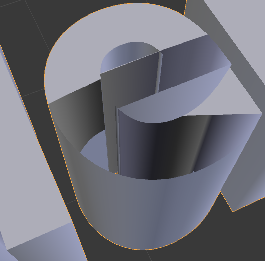
With the font you suggest, the area in question is tricking blender into thinking it has to deal with an extra line segment, this line segment however doesn't connect to any other segments and also doesn't form a closed loop with itself.
In Inkscape if you pick this Embossed Font and make a text object, with just the uppercase L, and convert it to a path (Path > Object to Path) you will notice this stray line segment. It shouldn't be there, but it is. Inkscape ignored it, but includes the path anyway.
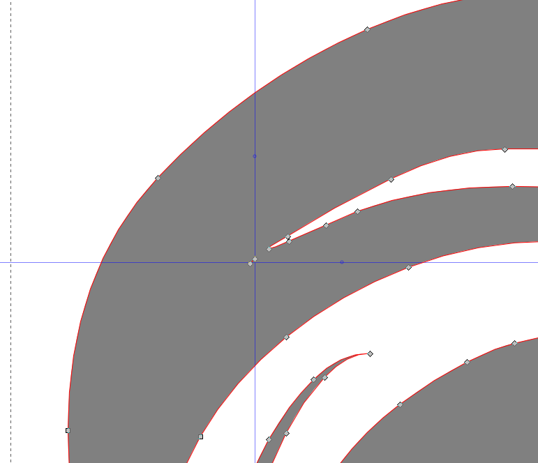
This is also exactly where blender throws its hands in the air.
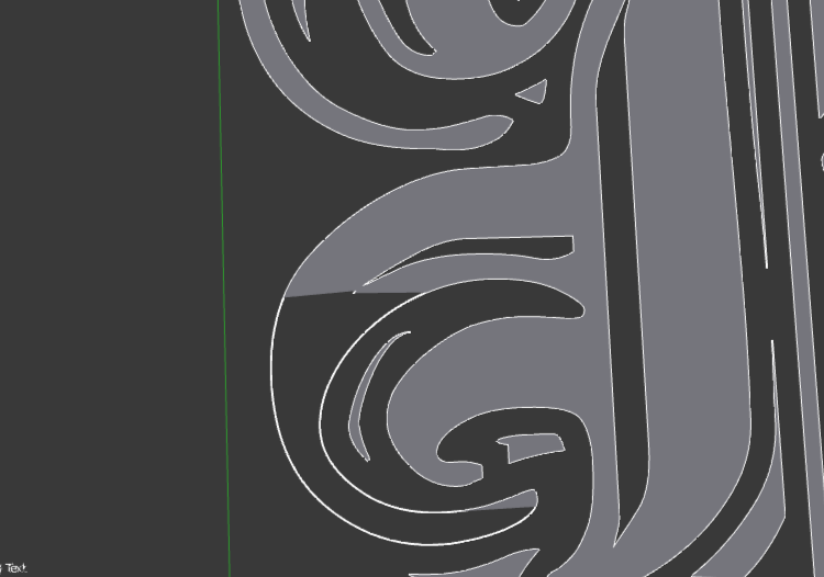
I'm sure if you inspect the other fonts where this peculiar stuff happens, they too suffer from stray line segments, and maybe self intersections.
A fix
You can edit fonts inside Blender, and remove the usual suspects.
With the font in object mode, go to:
Object -> Convert To -> Curve from Mesh / Text, or AltC-> Curve from Mesh/text
Now you can deal with stray lines, (delete them) and still apply Extrude, etc. Unfortunately this operation doesn't allow you to correct typos in the existing text object any more, because it has been converted to a Curve.
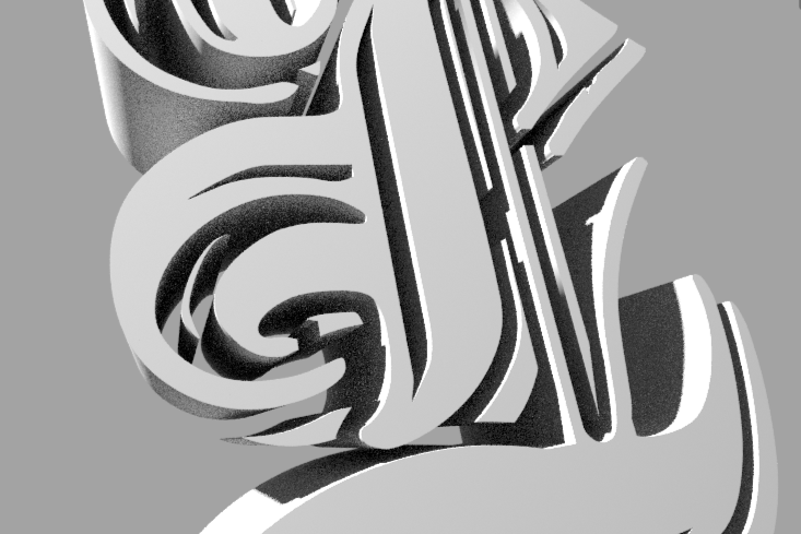


.001. Bfont breaks at.026. $\endgroup$